So this week my pick's for my fave finds I found while browsing my "library" at Chapters on my much appreciated and needed day off! The beauitiful pieces jumped off the pages to grab me. First I saw some stunning china by Kate Spade using the designs of the late eccentric Australian designer Florence Broadhurst. 
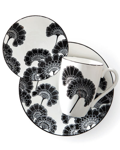
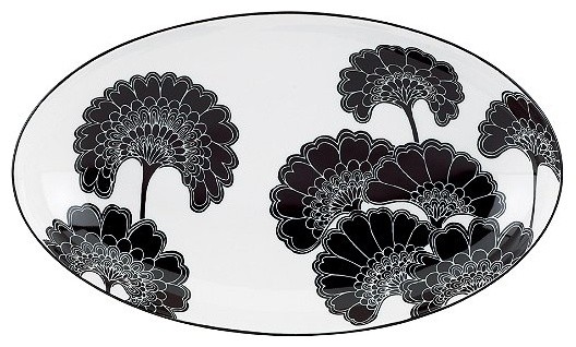
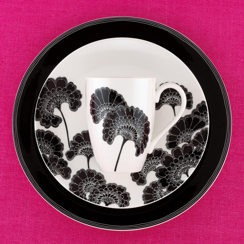
These graphic Japanese floral prints would make a sophisticated statement on your table or even on your walls as art! Take a good look at the Kate Spade site for more amazing dishes , rugs and pillows as well as the well known purses associated with the Spade name.
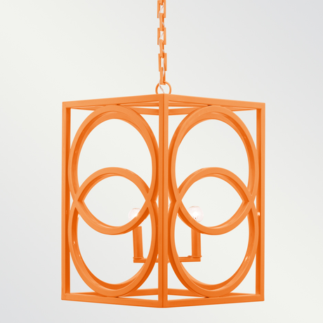
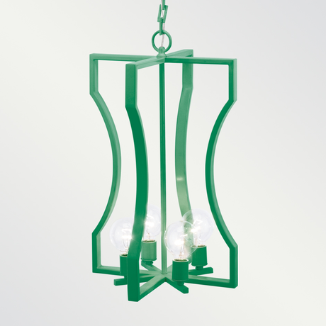
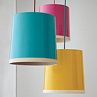
 
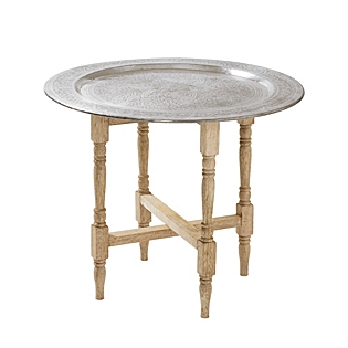
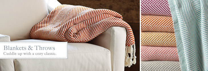
Finally I found some cozy blankets with great chevron patterns and colour for every space. These were from a great company "Serena and Lily" , they have been featured many times in design magazines I follow. Their website has so many funky, ethnic pieces like Morrocan style lamps, bedding and furniture. Be sure to check them out. I am happily awaiting their latest catalogue.
0 Comments
I was reading my daughter's fashion magazines yesterday and noticed a neon overload! It had caught my attention before when out shopping and in other magazines. i would see a cute shirt or a pair of vibrant jeans and it would take me back, way back to the 80's when I wore them all the first time around. Here are some on trend neon fashions made to influence . As always the fashion trends trickle down to interior design and we start seeing shocking pink chairs and lime green lamps. I don't know how much of it I would use in the main spaces in my home but I did use hot pink in my daughters room,not quite neon but close. Take a look at these fun and funky ideas and see if you want to embrace the NEON for the first time or again if like me you were an 80's teenage, Madonna Wannabee!While taking my daily dose of "Pinterest"" I came across some great pictures of old shutters used in different ways. We usually expect to see them on the outside of our homes and sometimes inside. They add a finishing detail to our exterior siding or brick. They looked great new or weathered and can come in all colours of the rainbow. Nowadays they are mass produced and are made of mostly pvc, sometimes aluminium but originally they would have been hand crafted wood. The interior shutters are pvc or wood and give your windows a classic look, easy maintenance and practical durability and function. The pictures I saw gave me new ideas to contemplate. Take a look at what I found. . . . . . . Next time you are at a garage sale or a flea market see if you can find a shutter and come up with your own unique way to use it. If not why not just paint the ones on your house a new colour or add some inside instead of drapes.
With my eyes always on design I have really noticed a touch of felt in even unexpected places. We are used to felt pads under furniture but not the furniture itself! On the weekend I saw a fabulous sofa set upholstered in grey felt and on my recent trip to the Toronto Interior Design Show I saw headboards, pillows, and even lighting. It's a traditional, durable and simple textile that up until recently took a back seat and now it covers the front seat and more! felt/felt/ Noun: A kind of cloth made by rolling and pressing wool or another suitable textile while applying moisture or heat, causing the fibers to mat... Verb: Make into felt; mat together: "the wood fibers are felted together". More info »Wikipedia - Dictionary.com - Answers.com - Merriam-WebsterHere are some fabulous felt examples!. If you fancy some felt then take a closer look when you are out shopping, I know I will . . . . . . . . .Ottawa, The Rideau Canal- Longest skating rink in the world . This weekend I had the urge to check out some great vintage stores. So while in downtown Ottawa checking out the world's longest skating rink with my family, enjoying the cold and the beavertails, I detoured and dragged them to a couple of my favourites. First stop was "The White Monkey" - a great spot for vintage furnishings, lighting and accessories. This time I noticed the pops of orange throughout, just like I said in my last post, it's being seen everywhere. I loved a sleek 60's seating set upholstered in grey felt mixed with teak finished off with orange pillows. It is certainly added to my list of must haves which is getting so long I can't find the beginning anymore! Next on the tour bus we went to "Ragtime Vintage" on Flora Street, this is an amazing Aladdin's cave of clothing from all era's, everywhere you look there are treasure, shining to get your attention. It is packed to the rafters and you really have to be in the mood to hunt but it is worth it. The first piece I saw was a great floppy hat just like the one on this month's Vogue cover worn by Taylor Swift. My son found some classic leather Converse, and some retro bow ties and a cool top hat! I spotted a few owl necklaces I liked and my daughter saw a vinatge dress hanging way up high. It's a fun way to spend some time on a Saturday afternoon and find something unique and interesting. My last stop of the day took me to Carelton Place a small town outside of the city to visit two amazing entrepeneurs at the Tin Barn Market. I had visited them several times at a different location last year but this day they were holding a one day Valentine event at a historic stone house showcasing their great vintage, salvaged and pre-loved finds. They are always on the look out for great pieces, scouring hotspots throughout Ontario. just recently returned from Toronto they decided to host this fun event displaying everyhting in unique ways using all their fabulous finds. I picked up a nice cake stand that I plan to use in many ways. Either for food or my scrapbooking supplies, you could also use it in your bedroom as a jewellery stand. I also grabbed a salvaged letter S representing my last name, it needs a little fine tuning possibly painting but it will add character to a shelf in my home. It's fun to imagine where it came from and sometimes we are lucky enough to find out. I will let you know when their next soiree will be taking place, I wouldn't miss it! Here are some of the Tin Barn's collectiblesIf you are local to Ottawa take a look at these great places, if not search your own area and see what you can find. . . . . . As I mentioned in my IDS 12 post the dominant colour featured was ORANGE. Whether it was on the walls, the floors or just in the advertising it was definitely making it's presence known. I have seen it used in many variations of it's original form lately for instance as coral and tangerine. Depending on where you want to use it and how much of a statement you want to make, choose carefully. A complete orange room may be too much for most people but a few pretty coral pillows tossed on your sofa may really give you that lift! My favourite orange-like paint colours at the moment from Benjamin Moore are :- Tangy Orange 2014-30Oriole 2169-30. looks sophisticated paired with a cool grey like Metropolitan AF-690. The grey tempers the orange. HERE ARE SOME ZINGY ORANGES TO ADD SOME ZIP TO YOUR DAY!My recent road trip to Toronto took me to IDS 12, Canada`s largest show featuring up and coming designers as well as established names in the field from all over Canada and the world! You can see amazing furniture, lighting, furnished rooms and products for all areas of your home. It`s also a great opportunity to get up close and personal with talented professionals and listen to what they have to say about the world of design. My favourite talks are always by Brian Gluckstein who is admired throughout North America and in Europe. He is also a regular on Cityline, a long running show made in Toronto. Another popular guest on the show is Sharon Grech who works for Benjamin Moore as Colour and Design Manager and spokesperson. I have been lucky enough to meet her on several occasions and did so again at this years show. She is always ahead of the curve with the colour trends for your home and how we can use them. Here we are hanging out at the Benjamin Moore booth. We chatted about her recent trip to Paris for a HUGE design show Maison d"Objet. (FYI I would love to go one day!) and also her upcoming trip to San Francisco, all in the space of two weeks. Wow talk about life in the fast lane!! I noticed at the show one of the underlying themes was mixing natural with industrial. Great rustic wooden tables with metal legs, reclaimed wood used as headboards and accent walls. The main exhibits "How do you live?" were spaces designed inside shipping containers, with well patined exteriors. My two favourites were " Touchable" by Jill Greaves design and "Layered" by Mazen el- Abdallah Both these spaces featured great lighting, wood elements and a sense of calm and sophistication. Also the predominant colour was definitely orange if not in the designs then in the displays and the advertising. We are going to see this colour in many variations. Keep your eyes "peeled"! The design talks were as always informative and encouraging ( I see changes in my house coming up-yet again!!). First up Lynda Reeves and Marilyn Dennis discussed the trends here now and to come. Here is my condensed version of it. Warm metals- like brass and gold. |